( ux case study )

Fernando
Martin Atelier

How you design a website for an architecture studio so it feels like moving through the buildings, not scrolling a grid of thumbnails.

Read
Client
Fernando Martin Atelier
Role
Design + build
Surface
Portfolio SPA · web
Scope
UX · IA · Motion · Build
Timeline
2026
Live
fmarchitects.in

It is 11 p.m. and Alan has opened his fourteenth architecture studio this week. Thirteen were the same dark grid of thumbnails. He does not remember a single one.

Fernando Martin Atelier is a Calicut practice with a Spanish principal and a body of work built on context: climate-responsive, deeply site-specific buildings that are quiet and considered. Fourteen projects across homes, hospitality, interiors and public work. The website had to be all of that, a place where the work could breathe, fast enough for a phone in Kerala and unmistakably the studio’s own.

We designed and built it end to end: the experience, the information architecture, the interaction and motion language, the visual system, and the front-end. This is the story of the decisions, and of what each one cost. We tell it through Alan, because he, not the awards jury, is who every choice was actually for.

( the customer )

Alan R.

Prospective client · building a family home · Kerala

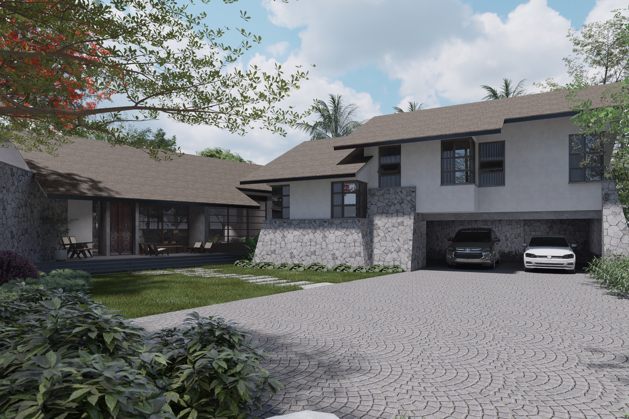
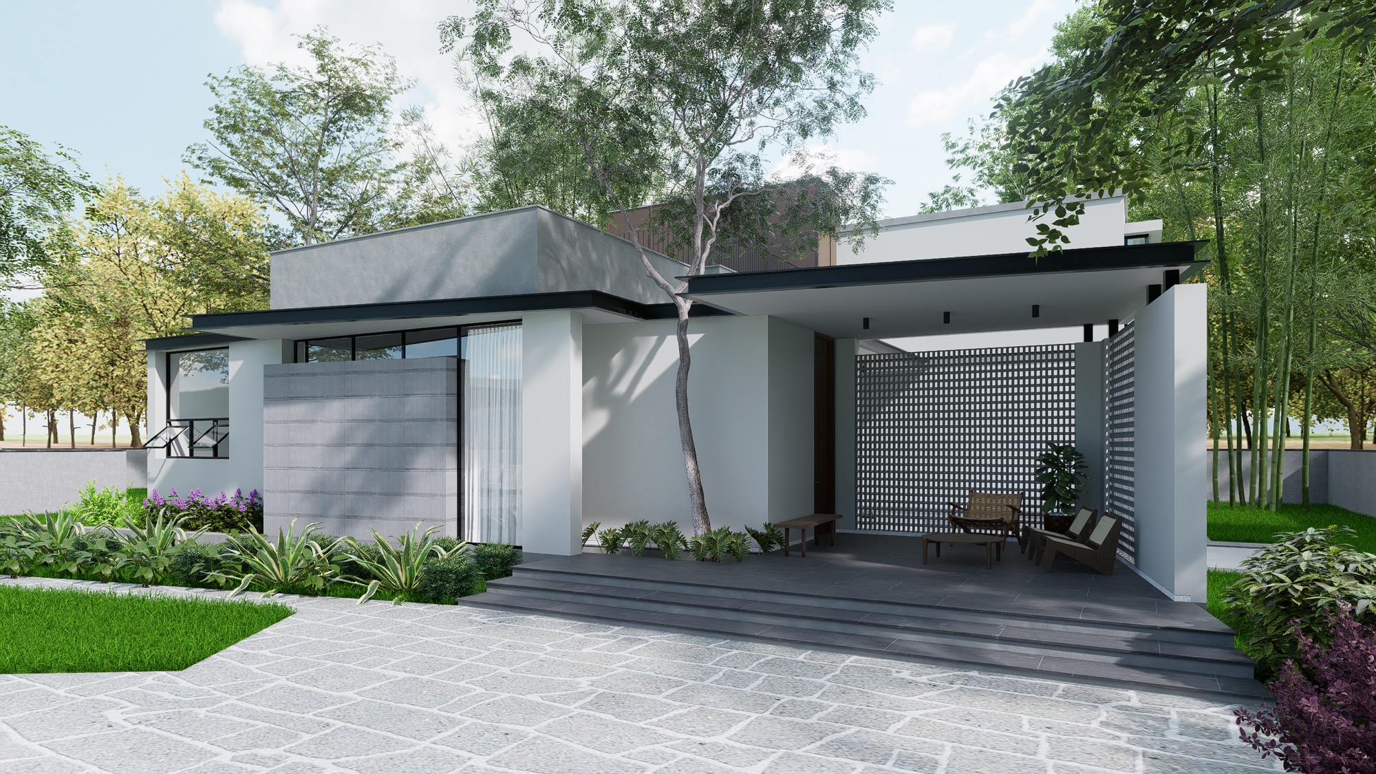
A Fernando Martin Atelier residence, the kind of home Alan is imagining
  • 01

    He cannot read a floor plan.

    Alan judges a studio the way most clients do: by feel, and by whether the work looks like the life he wants. Plans and sections mean nothing to him. Photographs and atmosphere mean everything.

  • 02

    Every studio site looks the same.

    This is his fourteenth architecture site this week. Thirteen were the same dark grid of thumbnails, the same three-column hover-zoom. By the second scroll they blur together, and so do the studios behind them.

  • 03

    He is on a phone, at night, distracted.

    The decision to reach out will not happen at a desk with a project brief open. It happens in bed, one-handed, between two other tabs. If reaching the studio takes a form, it does not happen at all.

( where we started )

The first version was a template in disguise.

An earlier build already existed: a conventional dark theme on a Webflow template, running heavy smooth-scroll and a rotating-wireframe intro. It was competent. It was also indistinguishable from every other studio site Alan had scrolled past that week, a grid of thumbnails wearing a moody filter. The problem was not polish. The problem was that it looked like architecture-website, not like this studio.

the commitment

Rebuild it so the interface behaves like the studio’s architecture: warm, quiet, precise. Make the work something you move through, not something you scan.

Chapter 01( the homepage )

A canvas, not a grid.

Alan lands not on a menu but on an open plane of renders he can grab and throw in any direction, with the studio's name sitting behind the work, not above it.

The default for an architecture portfolio is a grid: rows of thumbnails, a filter bar, a hover zoom. It is efficient and it is forgettable, and forgettable is the one thing this studio could not be. So we made the homepage a single, infinite, draggable canvas. Project renders are scattered across a faint blueprint grid, and you pan through them like an architect sliding a drawing across a desk.

Underneath the scatter is a quiet discipline. The layout is a 50-slot masonry tile (five rows, ten columns) whose card heights come from a seeded hash, so the composition looks hand-placed but never reshuffles between visits. That tile is cloned into a three-by-three grid and wrapped with modulo math, so Alan can drag in any direction forever and never hit an edge. Fourteen projects feel like an endless gallery.

The motion had to feel like weight, not like software. On release, the canvas carries momentum and decays at a fixed friction, so a flick glides and settles rather than snapping to a stop. The studio's full name sits centred behind everything, and the moment Alan starts to explore (more than fourteen pixels of drag) it fades to a third of its opacity. The brand introduces itself, then steps out of the way of the work. That is the whole thesis of the site in one gesture.
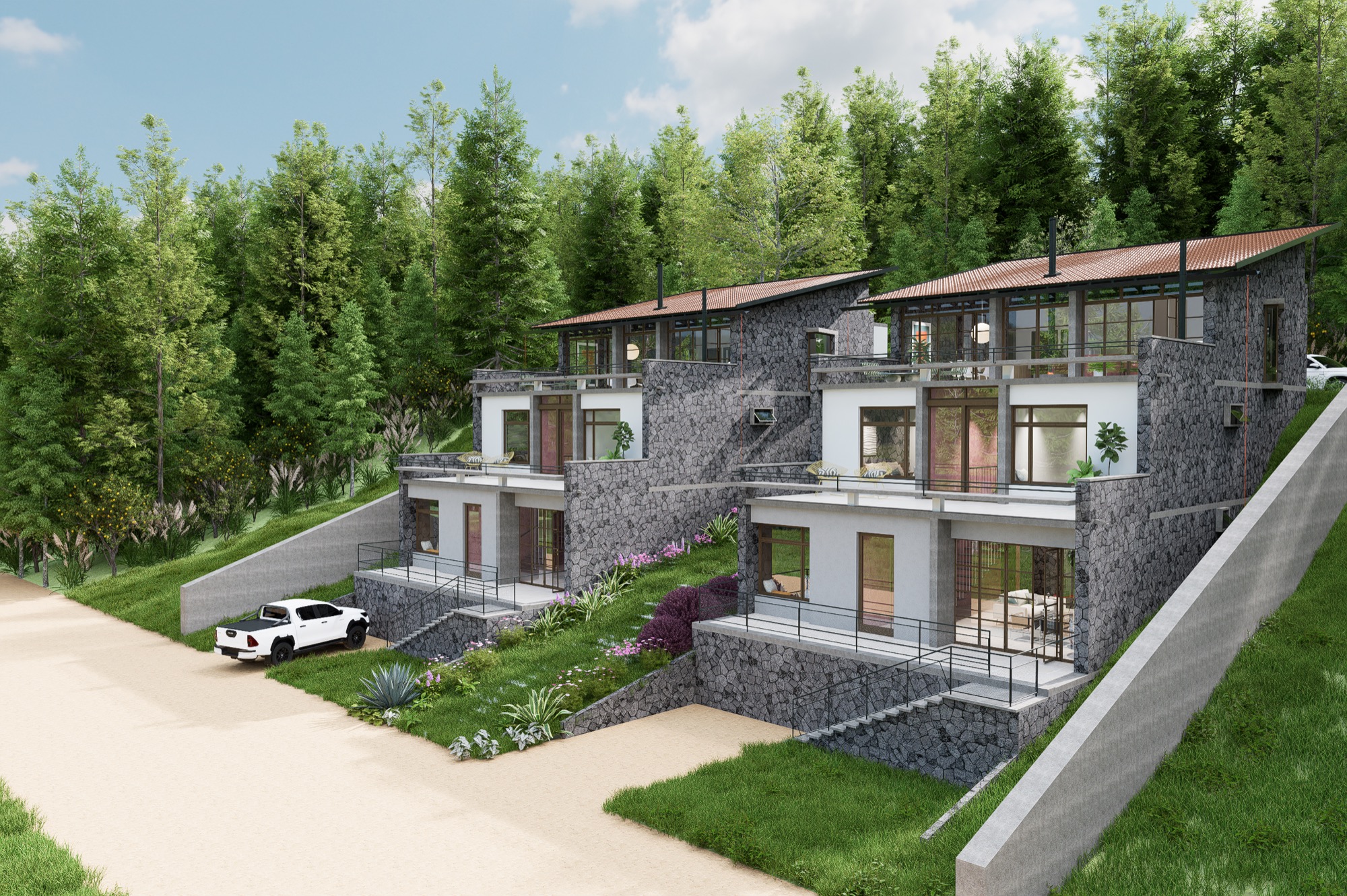
drag
The homepage: renders scattered on a blueprint grid, the wordmark behind them, receding as you start to drag.
the decision
Considered
A conventional filterable thumbnail grid, scannable and safe.
Chose
An infinite drag-to-explore canvas that feels like moving through the work.
Sacrificed
Scannability. A canvas has no top, no count, no 'you are here'. We accepted that cost here and paid it back in Chapter 2 with a structured index, arrow-key and trackpad panning, and a screen-reader list of every project.
Chapter 02( wayfinding )

A site with no pages.

One HTML document, and yet Back, Escape, and a shared link all behave exactly the way Alan expects them to.

A draggable canvas is usually where good navigation goes to die. Everything is one page, so the browser Back button either does nothing or throws you out of the site entirely, and no link you copy ever points at what you were looking at. We refused that trade.

Every destination (a project, the journal, an article, About, Contact) is a real, deep-linkable URL backed by a small history router. Opening a project pushes a state; the canvas is always the base that Back returns to; Escape closes whatever overlay is open; and pasting a link to Villa Calma opens the site directly on Villa Calma. The site behaves like a multi-page website and moves like a single-page app.

Then we gave the canvas the overview it deliberately lacks. A Projects index groups all fourteen works into the studio's five typologies (Residential, Hospitality, Interior, Commercial, Others) in a two-pane browser: an accordion on the left, a live preview that follows your cursor on the right. Alan who wants to wander gets the canvas. Alan who wants the list gets the list. Neither is punished for how they think.

fmarchitects.in/?project=villa-calma
Canvasthe base — Back always returns here
Projects overlay?view=projects — grouped by typology
Villa Calma?project=villa-calma — deep-linkable
Esc closes · Back pops the stack · a link opens straight on
Overlays are real URLs. Back and Escape return to the canvas; a shared link opens straight onto the project.
the decision
Considered
Letting the canvas be the only way in, pure and uncompromised.
Chose
A canvas plus a structured, categorised index behind the same nav.
Sacrificed
A little purity. Two ways to browse is more to build and maintain, but discoverability is not negotiable on a site whose entire job is to get a project opened.
Chapter 03( the project )

A walk-through, not a slideshow.

Alan opens Villa Calma, and the page moves the way you move through a house: a slow entry, then a paced rhythm of rooms.

A project page is where the sale is actually made, so it could not be a lightbox grid of equal squares. We authored it as a sequence. The hero is full-bleed and scrubs gently on scroll, the image easing up and out as you enter, the way a building reveals itself as you walk toward it. The title sits low and heavy over it. Metadata stays to a whisper: category, year, client. Everything else gets out of the way.

The gallery below runs on a deliberate rhythm rather than a uniform grid: a full-bleed frame, another full frame, then a paired split, repeating. Full images are the establishing shots; the pairs are the details, the joinery, the light. Each frame carries a faint parallax so scrolling feels like depth, not like a spreadsheet advancing. It reads as an edit, not an archive.

The last decision on the page is the most important one: no dead ends. Every project closes with the next project already loaded and waiting, cycling endlessly through all fourteen. Alan never arrives at a full stop and a Back button. He arrives at the next building, and the next, until he decides he has seen enough to write to the studio.

Villa Calma, full-bleed establishing frame
Interior detailInterior detail
fullfullpairnext project ↻
The gallery rhythm: full, full, pair. Establishing shots, then details, ending on the next project already queued.
the decision
Considered
A click-to-zoom lightbox for full-resolution inspection of every render.
Chose
An authored scroll-journey with a fixed gallery rhythm and an endless next-project loop.
Sacrificed
Pixel-peeping. You cannot pop a render to full screen. We decided a curated sequence sells design intent better than a zoom tool sells pixels, and that keeping people moving beats letting them stop to inspect.
Chapter 04( the studio )

A story told like architecture.

'Architecture as narrative' is the studio's line, so the About page had to be one, not a team grid with a mission statement.

Most studio About pages are a credibility checklist: a headshot row, a client-logo strip, an awards shelf. We cut all of it for a single narrative spine. The page opens on the practice's belief (space is experienced, not merely occupied) and then earns it with the one story no competitor can copy: where the FMA mark actually comes from.

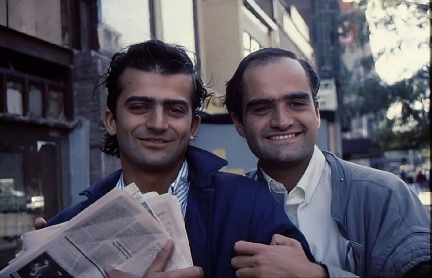
The identity is built around the Legacy of Juan Botas, a Spanish architect-illustrator whose hand-drawn line the studio inherited. We told that story with two identity cards, a founder portrait and the original mark, that parallax in opposite directions as you scroll, so the section quietly breathes. The point is not decoration. The point is that a prospect leaves remembering one specific, human thing about this studio and not one generic thing about all studios.

It is worth being honest about the risk here. Narrative over credentials is a bet that Alan wants to feel something more than he wants to tick boxes. For a design-led studio courting design-literate clients, that is the right bet. For a firm competing purely on scale or price, it would be the wrong one.

Juan Botás and Fernando Martin, New York, late 1980s
The original hand-drawn FMA mark by Juan Botás
Legacy of Juan Botás
The identity story: two cards, a portrait and the original mark, drifting in opposite directions as you read.
the decision
Considered
A standard team-and-awards page that answers 'can I trust them' in five seconds.
Chose
A single scroll-told story anchored on the studio's real origin.
Sacrificed
Quick-scan proof. There is no logo wall. We traded instant credentials for a story a client actually retains, and leaned on the work itself to carry the credibility.
Chapter 05( conversion )

Contact without a form.

Alan decides. There is no form waiting to interrogate him, just three ways to reach a human, WhatsApp first.

Every instinct in a portfolio build is to put a lead-capture form on the contact page: name, email, budget, project type, message. We deleted all of it. In Kerala, where this studio works, WhatsApp is not a nice-to-have channel, it is the business channel. A form is a wall between an interested person and a conversation.

So Contact is three direct-action cards, WhatsApp, email, phone, in that order, over a dark-mode studio map. Each is one tap to a real thread with a real person. Remember where Alan is: in bed, one-handed, at 11 p.m. The correct number of fields to ask him to fill in at that moment is zero.

The cost is real and we chose it with eyes open. The studio gets an unstructured 'hi, I loved Villa Calma' instead of a tidy CRM record with a qualified budget. For a boutique practice that would rather answer a warm message than sort a cold pipeline, an answered message beats a filled form every time. Different studio, different call.

WhatsApp
Start chat ↗
Email
info@fmarchitects.in
Phone
+91 75599 77441
no form · no fields · one tap to a human
Contact is three one-tap channels over a studio map. No fields, no validation, no wall.
the decision
Considered
A structured enquiry form that qualifies budget, scope and timeline up front.
Chose
A form-free, WhatsApp-first contact with three one-tap channels.
Sacrificed
Lead qualification and a clean record of enquiries. We optimised for the message getting sent at all, on a phone, at night, over the studio's convenience in triaging it.
Chapter 06( the craft )

One curve, a drafting voice, a warm dark.

Everything on the site settles; nothing bounces. That single decision, repeated everywhere, is most of what makes it feel like architecture.

The whole site moves on one easing curve, a fast-out, long-settle ease with no overshoot. Cards, overlays, hovers, reveals: all of it launches quickly and decelerates into place, like a heavy door on a good hinge. We could have varied the motion for interest. We deliberately did not. Uniform, unhurried motion is what reads as calm and considered, and calm is the brand.

The visual voice is a drafting room. Body type is a clean neo-grotesque; labels, dimensions and counts are set in monospace, so the interface speaks in the register of a technical drawing. A faint blueprint grid underlies the canvas. The palette is warm paper and a near-black brown rather than neutral black, with a single electric-blue accent doing all the pointing. And the whole thing carries a genuine light and dark theme, built from one set of tokens and flipped, respecting the visitor's system preference. The switch in the corner of this very page runs on the same mechanism.

Honesty, because a case study that only lists wins is marketing. The reveals and canvas physics are wrapped in a reduced-motion guard, alt text is written for humans, and hover-only content becomes always-visible on touch. But two gaps are real and worth naming: keyboard focus states are not yet designed, and the heavy architectural renders ship lazy-loaded but without responsive sources. Both are on the list. Neither is pretended away.

easing · one curve
settle, never bounce
type · drafting voice
Aa
01 · RESIDENTIAL · 2025
The system: one easing curve, a mono drafting voice, a blueprint grid, and a warm light/dark theme from one token set.
the decision
Considered
Varied, characterful motion tuned per component for delight.
Chose
One restrained easing curve applied to the entire site.
Sacrificed
Playfulness. There is no spring, no bounce, no surprise anywhere by design. For an architecture studio, discipline reads as taste. For a toy brand it would read as boring.

The work it holds.

( 14 projects )
Villa Calma
( 01 / 06 )
Villa Calma
House of Movement
( 02 / 06 )
House of Movement
Mahé Interior
( 03 / 06 )
Mahé Interior
Kodaikanal Weekend Home
( 04 / 06 )
Kodaikanal Weekend Home
Wayanad Farm
( 05 / 06 )
Wayanad Farm
House in Bangalore
( 06 / 06 )
House in Bangalore
( outcomes )

What we can honestly claim.

Here is the honest part. We have not instrumented analytics yet, so we cannot show you a conversion lift or a time-on-site number, and we would rather say that than invent one. What we can point to is the site itself: live at fmarchitects.in, described as award-winning, and doing the one thing an architect’s site should, getting out of the way of the work.

The strongest evidence is in the craft that a screenshot cannot carry: a canvas that reads a fourteen-pixel drag as intent so nobody navigates by accident, a history router that means Back and a shared link never break, a reduced-motion path for people who need it, and a single easing curve that makes the whole thing feel like one calm hand. It is a site that a design-literate client remembers, which is exactly what Alan needed it to be.

And the gaps, named plainly: keyboard focus states are not yet designed, the heavy renders need responsive sources to stay light on slow connections, and there is migration debt from the old build still in the repo. None of it is hidden. All of it is next.

( closing )

What we would do again, and what we would do differently.

Again: bet the whole homepage on one idea. The canvas is a risk, and risk is the only reason anyone remembers it. Again: build the structured index behind it, so the risk never costs a lost visitor. The two together, the daring front door and the dependable hallway, are the shape of the whole project.

Differently: design the keyboard and focus story on day one, not as debt, and settle the image pipeline before the render count climbs. And we would collapse the two half-migrated systems in the repo into one, sooner. Next up is exactly that, plus the analytics that will finally let us replace this honest paragraph with numbers.

If you are an architecture or design studio and your website looks like everyone else’s, this is the kind of build we love. We are happy to walk through it in person.

FMA